
Checklist for UI elements for a landing page for better user-centric content, SEO, and performance
Here's a generic checklist for UI elements that you need to create a great landing page that will help you and provide you with a basic idea and insights to create a homepage for a company, a client's website, or your freelance services as well as a product/app landing page that you are working on.
Remember that this is just a general checklist and the specific UI elements needed for a landing page may vary depending on the goal, audience, and other factors.
| UI Element | Purpose |
|---|---|
| 1. Headline | Quickly grab attention and communicate Make it clear, concise, and benefit-driven |
| 2. Sub-headline | Elaborate on the main message and Use it to provide more context and detail |
| 3. Call-to-action (CTA) button | Encourage visitors to take a specific action Make it stand out and use persuasive language |
| 4. Form | Collect visitor information and generate leads Keep it short and ask only for necessary information |
| 5. Visuals (images, videos, graphics) | Convey information and evoke emotions Use high-quality visuals that support the main message |
| 6. Social proof (testimonials, reviews) | Build credibility and trust Use real and relevant quotes from customers or industry experts |
| 7. Navigation | Help visitors easily access other pages Keep it simple and minimize distractions |
| 8. Footer | Provide additional information and links Include contact information, copyright notice, and other relevant links |
| 9. Mobile responsiveness | Ensure the landing page is optimized for mobile devices Test the page on different screen sizes and orientations |
| 10. Loading speed | Ensure the landing page loads quickly Optimize images, use caching, and minimize server requests |
Below is the description for each element mentioned above:
Headline

Purpose: Quickly grab attention and communicate the main message.
Description: The headline is typically the first thing visitors see on a landing page. It should be clear, concise, and attention-grabbing, effectively conveying the main message or value proposition of the product, service, or offer. It should be compelling enough to entice visitors to continue reading or exploring the page further.
Sub-headline

Purpose: Elaborate on the main message and entice further reading
Description: The sub-headline provides additional context and expands on the main message introduced in the headline. It can be used to provide more details, highlight key benefits, or address specific pain points of the target audience. It should be succinct and compelling to maintain the visitor's interest and encourage them to continue engaging with the page.
Call-to-action (CTA) button

Purpose: Encourage visitors to take a specific action
Description: The CTA button is a crucial element that prompts visitors to perform a desired action, such as signing up, making a purchase, or starting a free trial. It should be prominently placed, visually distinct, and use persuasive language that clearly communicates visitors' actions. It's essential to create a sense of urgency or emphasize the value of the action to increase the conversion rate.
Form

Purpose: Collect visitor information and generate leads
Description: A form is used to collect visitor information, such as name, email address, or other relevant details. It plays a vital role in lead generation and allows businesses to follow up with interested prospects. When designing a form for a landing page, it's important to keep it concise and ask for only essential information to minimize friction and increase completion rates. Clear instructions and error validation should also be provided to ensure a smooth user experience.
Visuals (images, videos, graphics)
Purpose: Convey information and evoke emotions
Description: Visual elements are powerful tools to communicate information and evoke emotions. They can include images, videos, graphics, or illustrations that support the main message of the landing page. High-quality visuals should be chosen to enhance the user experience and make the content more engaging. Images or videos that demonstrate the product or service in action, showcase benefits or depict real-life scenarios can be particularly effective in capturing the visitor's attention and conveying the value of the offer.
Social Proof (testimonials, reviews)
Purpose: Build credibility and trust
Description: Social proof elements, such as testimonials or reviews from satisfied customers, help establish trust and credibility. Including real quotes, customer success stories, or ratings and reviews can reassure visitors that others have had positive experiences with the product or service. This can increase confidence and conversion rates. It's important to choose authentic and relevant testimonials that highlight the benefits and outcomes achieved by customers.
Navigation

Purpose: Help visitors easily access other pages
Description: Navigation elements, such as menus or links, enable visitors to explore other sections or pages of the website. On a landing page, the navigation should be kept minimal and unobtrusive, with a focus on the primary conversion goal. Avoid distracting or overwhelming visitors with excessive navigation options. It's important to ensure that the navigation is intuitive, consistent with the overall website design, and leads visitors to relevant information or conversion points.
Footer
Purpose: Provide additional information and links
Description: The footer is typically located at the bottom of the landing page and provides additional information or links that visitors may find useful. It commonly includes contact information, social media icons, copyright notices, privacy policy links, terms of service, or other legal information. The footer can serve as a navigational aid, allowing visitors to access important pages or contact the business easily. It should be designed to be consistent
Mobile Responsiveness
Purpose: Ensure the landing page is optimized for mobile devices
Description: When a landing page is mobile-responsive, it means that it can be easily accessed and navigated on mobile devices without sacrificing user experience or requiring excessive zooming or scrolling. The content and elements on the page automatically adjust and reposition themselves to provide an optimal viewing experience, ensuring that the page remains readable, functional, and visually appealing on smaller screens.
A mobile-responsive design ensures that the layout, content, and functionality of a website automatically adjust and adapt to fit the screen of the user's device. This means that visitors can view and interact with the website without the need for excessive scrolling, zooming, or horizontal scrolling. The goal is to provide a seamless and user-friendly experience, regardless of the device being used.
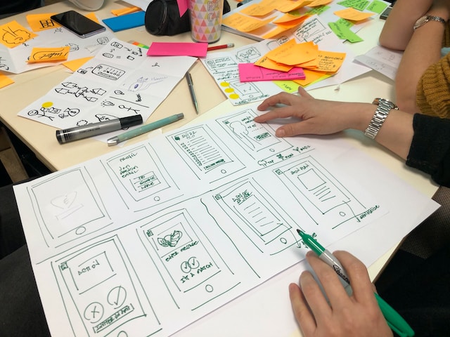
Mobile responsiveness involves several key considerations:
Responsive Layout: The layout of a mobile-responsive website is designed to be flexible and fluid. Elements, such as text, images, and navigation menus, stack or rearrange themselves based on the screen size. This allows the content to be easily readable and accessible on smaller screens without compromising the overall design.
Media Queries: Media queries are CSS techniques used to apply specific styles and rules based on the characteristics of the user's device, such as screen width, resolution, or orientation. By utilizing media queries, web designers can tailor the presentation of content to different devices and optimize the user experience accordingly.
Touch-Friendly Interactions: Mobile devices primarily rely on touch input, so a mobile-responsive design takes into account touch-friendly interactions. This includes ensuring that buttons and links are large enough to be easily tapped with a finger, spacing elements to prevent accidental taps, and utilizing swipe gestures for navigation or content interaction.
Performance Optimization: Mobile responsiveness also considers performance optimization to ensure fast loading times on mobile devices. This involves optimizing images, minimizing the use of large files or heavy scripts, leveraging browser caching, and reducing the number of server requests to deliver a smooth and efficient user experience.
Loading Speed
Purpose: Ensure the landing page loads quickly
Description: Landing page loading speed refers to the time it takes for a landing page to fully load and become visible to the visitor after they click on a link or enter a website. It is a measure of how quickly the content, including text, images, videos, and interactive elements, is displayed on the visitor's screen.
Fast loading speed is crucial for a landing page because it directly impacts user experience and can significantly affect conversion rates.
Here are some key points to consider:
User Experience: A slow-loading landing page can frustrate visitors and lead to a negative user experience. Studies have shown that users have little patience for slow-loading pages and are more likely to abandon them if they take too long to load. A fast-loading landing page ensures that visitors can quickly access the information they seek, improving engagement and reducing bounce rates.
Search Engine Optimization (SEO): Page loading speed is a ranking factor used by search engines like Google. Faster-loading pages tend to rank higher in search results, as search engines prioritize delivering a good user experience. Optimizing the loading speed of your landing page can help improve its visibility in search engine results and drive organic traffic.
Conversion Rates: Slow-loading pages can negatively impact conversion rates. Visitors who have to wait too long for a page to load may lose interest, abandon the page, or even leave the website altogether. On the other hand, fast-loading pages create a positive impression, maintain visitor engagement, and increase the likelihood of visitors taking the desired action, such as making a purchase or filling out a form.
To improve landing page loading speed, several optimization techniques can be employed, such as:
- Optimizing image sizes: Compressing images without compromising quality can significantly reduce file sizes and improve loading speed.
- Caching: Implementing caching mechanisms allows browsers to store certain elements of a page, such as images or scripts, locally, reducing the need to reload them on subsequent visits.
- Minifying code: Removing unnecessary spaces, comments, and line breaks from HTML, CSS, and JavaScript code can reduce file sizes and improve loading speed.
- Using Content Delivery Networks (CDNs): CDNs distribute content across multiple servers geographically, enabling faster delivery to users by serving content from the server closest to them.
Regular performance monitoring and testing of your landing page's loading speed are important to identify and address any bottlenecks or issues that may arise. By ensuring a fast-loading landing page, you can provide a better user experience, increase engagement, and enhance conversion rates.










Comments